In my free time during Wintersession I was exploring new ways to use acrylic paints, and this method explored underpainting to focus on strong value structure/hierarchies of light. And it really helped to separate value and color, not to mention I love moments when the underpaintings peak from beneath the painting (like the alazarin crimson coming through the viridian greens).
However in a rush to explore this type of painting, I created two pieces that are super generic for me that had....zero concept. I think the filenames say alot about the concepts (YELL AND STEAL MAH JEWEL.jpg and my favorite: I GOTTA JAR.pg) hahaaaaa xP
Not to mention it continued my pattern of super nebulous environments/figures floating in space/only showing from the torso up.
Heh, I'm a huge fan of atmosphere and such, but I feel like I need alot more clarity in my environments before I continue to ~nebulify~ them.
(Nebulify definitely isn't a word, but it's a Sailor Moon transformation/attack in the making :D~ )
Anyway there's alot of good stuff for me to learn from these~ but I'm not sure if I'll be completing either of them. I do enjoy the two characters in I GOTTA JAR~! though :P
Also check out my superb anatomical skills in that clavicle of hers. . . x___x
Tuesday, March 29, 2011
C O L O R K E Y S
I've been trying to take things easier this spring semester, and I've been failing miserably.
For instance I'm currently on Spring Break, so I decided to stay and RISD and work on my portfolio/get my final internship applications out.
My newest priority is developing environments, and really having strong figure ground relationships. So I did a few color keys~ each is done in acrylic (probably 3 x 5 or 4 x 6) with a few digital touchups~
These came out alot more successful than I anticipated. I think being on break and not stressing about them really helped me~also I discovered a method to working with acrylics that really makes sense to me and just ~frees me~ and helps me work in a faster~bold and efficient~ manner.
Labels:
color,
color keys,
design,
environments,
odera igbokwe
Neuronsssssss~
Anyway for the first project I decided to explore neurons as character designs.
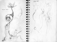
Here's the initial sketch stage where I explored the form of unipolar, bipolar, multipolar, and pyramidal neurons.
I started with the basic diagrammatic form of the bipolar neuron, and then came up with this guy
And here's the finalized sketches (one line drawing exploring the design, one page showing off the neuron's personality/turn arounds, and a rough color study:
Unipolar
Multipolar
Pyramidal
Labels:
art,
character design,
color,
illustration,
neuron,
neuroscience,
odera igbokwe
Wednesday, March 23, 2011
Watercolor and gouache
Learning and practicing~
I need to push my watercolors more, and have a better balance of the two rather than a ~watercolor glow~ thats mostly covered up with gouache haha
I need to push my watercolors more, and have a better balance of the two rather than a ~watercolor glow~ thats mostly covered up with gouache haha
Subscribe to:
Comments (Atom)


